Weverse, Global Kpop Community Platform
Jan - Jun 2019 | Sr Product Designer
Overview
Weverse is an official global K-pop community platform, where fans can engage with other fans around the world, communicate and interact with their favorite Artists. It started out as a K-pop platform, but later extended to host celebrities from all over the world.
Goal of this project, was to build a new type of community platform, where fans and artists can interact with each other with no language barrier.
My Role
Team: 2 Designer, 1 PM
Participated in launching the service from scratch, involved in early design proposal stage, service strategy, UX research, and iterations on main features, and contributed to Design System and UI Design of the iOS platform.
Why build Weverse?
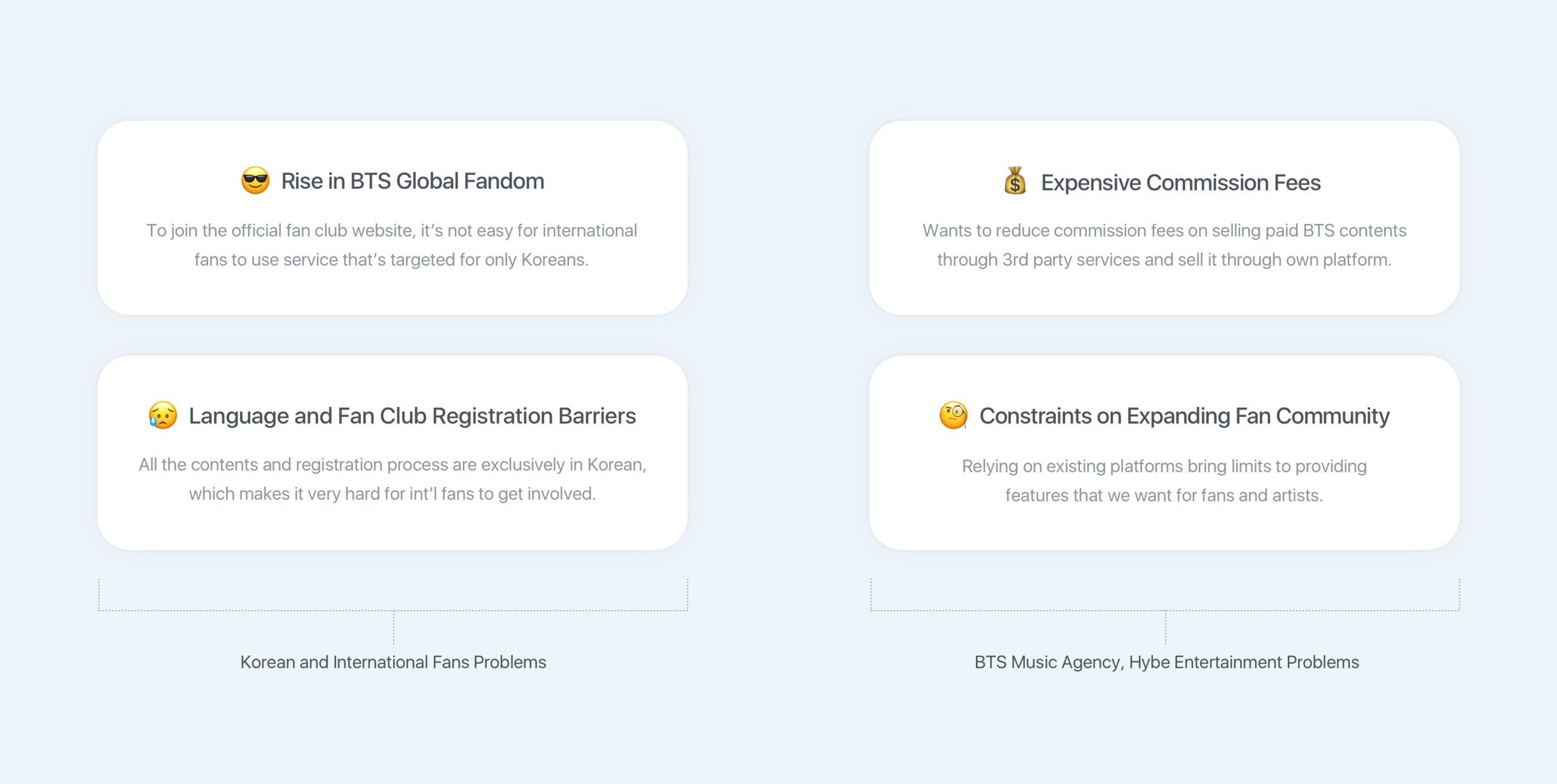
Previously in K-pop history, most K-pop artists used a Korean web service called Fan Cafe operated by famous Korean web portal called DAUM to communicate and interact with their fans. This was OK until Kpop group BTS became a global sensation and since then, problems started to emerge from both global fans and BTS’s music agency, HYBE Entertainment on using Fan Cafe as an official fan club website for BTS.
Before building Weverse, I first looked at the problems that each of these user groups were facing to help me get started.
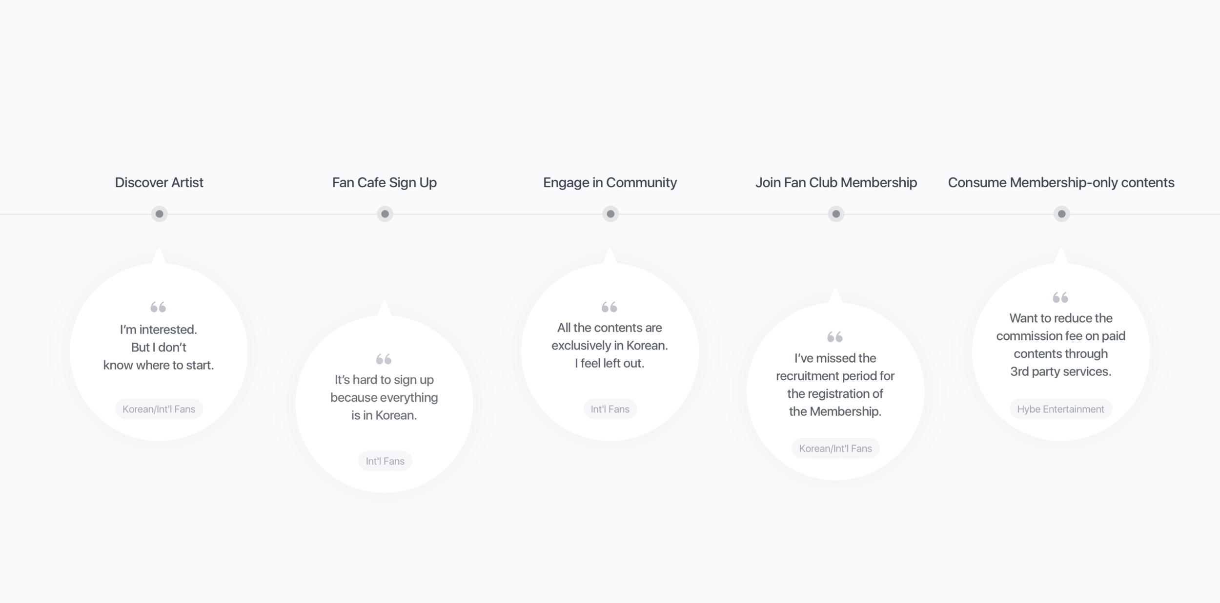
Problems of Previous User Journey of Offical Fan Club Website
I participated in identifying existing user journey of official fan club website and realized that one of the biggest problems international fans were facing was on language barriers which made it very hard for them to get involved with the community. This research helped our team focus on building a platform that can be used by fans from around the globe and also gave us insights on how we could lower the entry barrier to joining the service.
Service UX Strategy
I took part in drawing out three main keywords from research insights to define our service UX strategy and main features. Throughout continuous enhancing of our features, we were able to build a successful fandom platform used in 233 countries.
Weverse Design System 1.0
This project had only 4 months work period, and even though we were on a tight schedule, as a team we created a design system to increase work efficiency between designers and developers, to provide users with consistent experience for all Weverse branded platforms for usability, quality and reliability.
I conducted developing design pattern library on Sketch, and after the release, I suggested and collaborated on documenting our design system through a collaborative documentation site called, Zeroheight.
Main Feature Highlights
↓
Home
Home Screen act as a gateway to enter individual artist community. For the initial release, number of artists that joined Weverse was limited, so as a design team we had to think of a way to make Home look live and engaging. I contributed to idea of showing each artist community in a Card UI to be shown in carousel sliders focusing on promoting each individual artists.
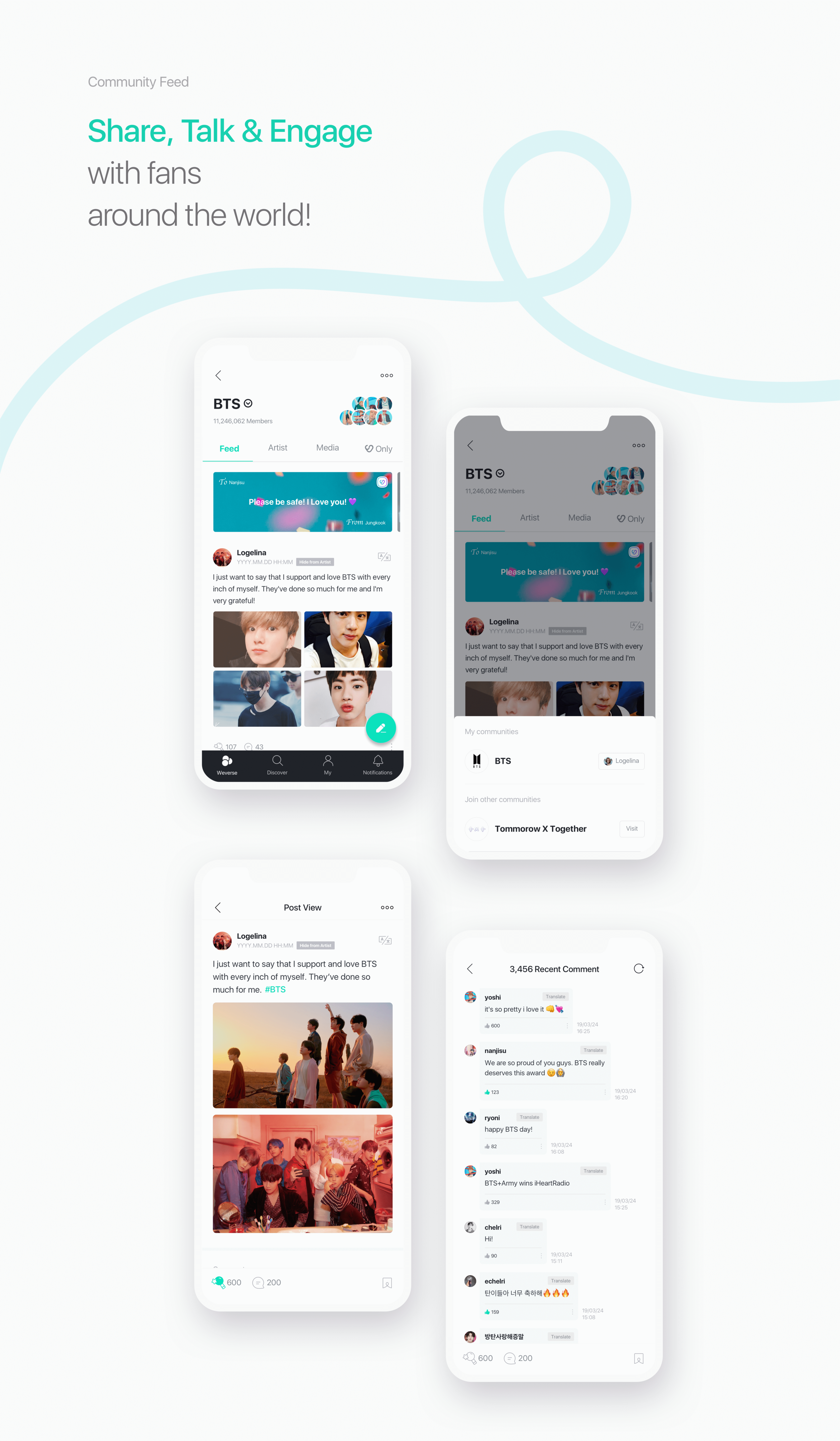
Community Feed
Each artist community consists of individual ‘Feed’, which is made up of ‘Posts’ that users upload. During the research phase, we realized that unlike Korean fans usually liking one artist at a time, International fans outside of Korea tended to like multiple artists at same time. Understanding these characteristics, we decided to design community feed allowing users to switch between multiple artist communities with tap of a button, by providing dropdown button next to the artist name that’s located on the Community Header.
#1. Emphasizing on Artist Comments —
After the initial launch, we monitored how fans and artists were using the product and discovered that due to endless comment threads written by fans, artist comments were lost within pile of comments which went against our purpose of providing ecosystem created together by fans and artists. To solve the problem, I contributed to idea of placing artist comment as a fixed floating position located at top of the comment screen, and by clicking on the comment we decided to relocate to the position where that comment actually exists to help users understand the context.
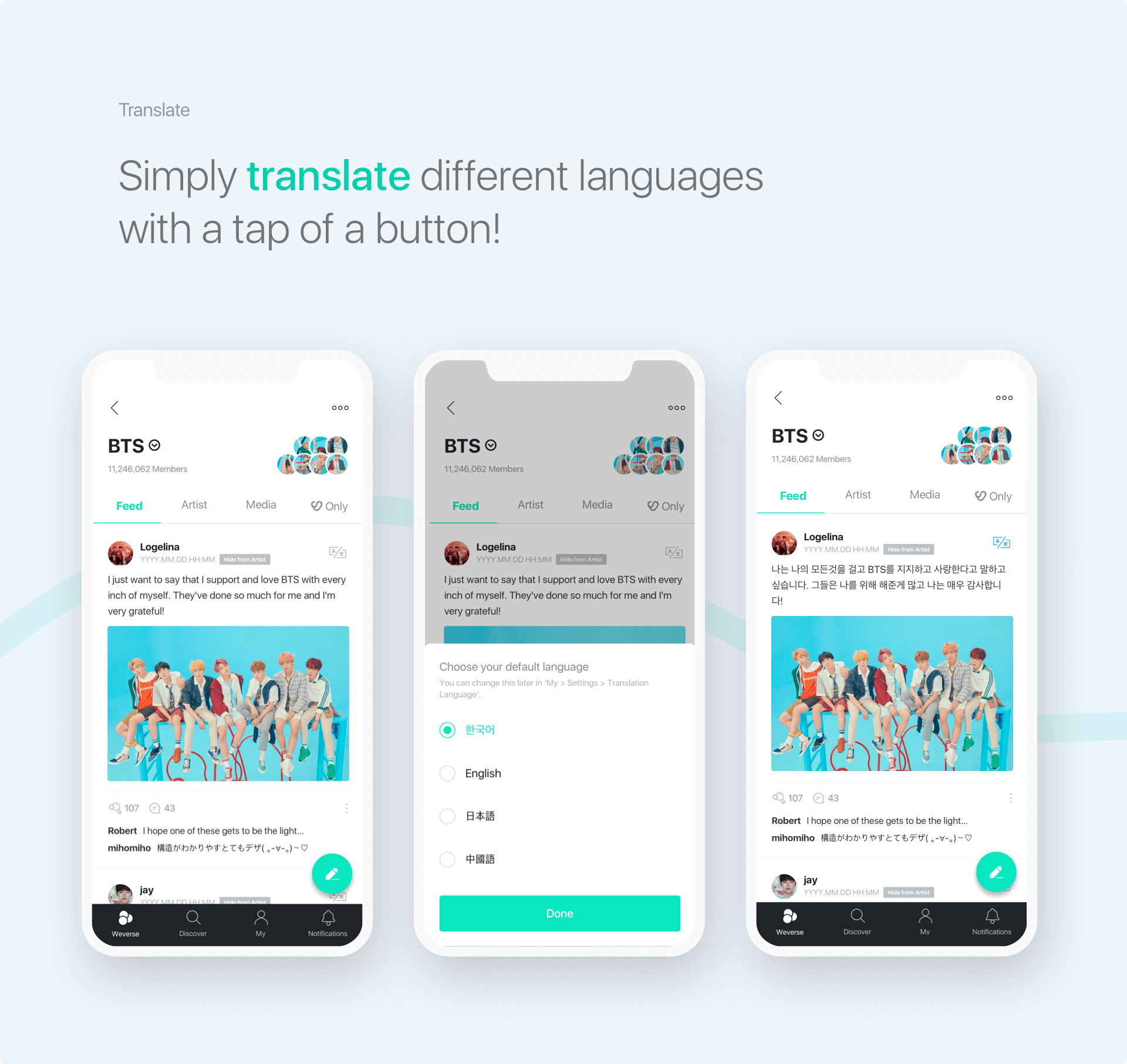
#2. Providing Instant In-app Translator —
To encourage fans and artists to engage with each other and go beyond language barriers, we provided in-app translator allowing users to set default translation language during sign up process, and by tapping on a button we offered instant translation. For the initial release, we offered Google translation in 9 languages (English, Korean, Japanese, Chinese, Spanish, Portuguese, Malay, Indonesia, and Thai) and I was responsible for interface design of iOS platform. After the release, we realized that Google Translation didn’t always provide accurate translations, so with the other designer in the team, we worked on iterations on providing user-generated translations to be added for future product roadmaps.
Artist Moments
Fans can stay in touch with artists and their latest updates through ‘Moment’, which is a feature like Instagram Story where artists can share their stories with their fans. I fully contributed to designing this feature, allowing fans to reply and cheer for Moment for 24 hours.
#1. Uploading Moment Flow (Artist Point of view)
Feel free to walkthrough on Lo-Fi Prototype
To encourage artist to communicate often with their fans, if artist hasn’t uploaded any Moment within 7 days, I designed a reminder banner asking artist to say ‘Hi’ to their fans on top of the feed screen which leads to Moment Editor when artists clicks on it.
#2. Viewing Uploaded Moments Flow (Fan Point of View)
Feel free to walkthrough on Lo-Fi Prototype
By inspired by concept of ‘Fan Letters’, I wanted to let fans feel like they’ve received a private letter from their favorite artist, and designed mini preview of Moments to look like an envelop showing recipient name as fan's nickname and sender name as artist name. By clicking on the Moment banner, it leads to Moment Detail screen allowing users to view the Moment and can also leave comment or cheer for the artist.
Post Editor
To differentiate ourselves from other fan communities, as a design team we looked at behaviors of how fans were using previous social networks and found out that there were certain times they want to talk or debate about a topic that they want to keep it secret to themselves. These kind of situations appeared when they wanted to encourage others to stream music videos, vote for awards, or prepare surprise events for their artist. With insights gathered, we designed a feature called ‘Hide From Artist’ which was placed inside post editor, and by tapping on the button users could create posts and hide their posts from artists seeing them.
Beside this feature, we allowed fans to also send fan letters through post editor by typing in #to_artistname when sharing the post.
I was also responsible for interface design of post editor for iOS platform.
Media
In order to strengthen our position also as a media platform, we brought in free to paid contents that were once sold on 3rd party services like Youtube, and Vlive from Naver onto our platform. This was very important for BTS’s music agency, Hybe Entertainment, because of expensive commission fees. By bringing in all the paid contents, it brought increase in revenue for the company.
After the initial release, in response to the COVID-19 era, we strengthened our relationship between fans and artists through online by hosting first-ever online BTS concert, ‘Bang Bang Con: The Live,’ on Weverse bringing more than 756,000 viewers joining from across the world.
Paid Fan Club Membership
Previous Korean Music Agencies all sold paid fan club membership during specific recruitment period, but problem with this process rose for BTS when they became a global sensation. For newly joined fans they had to wait for the next recruitment season to join the membership which took away benefits of pre-sale tickets to tours and concerts, and membership only contents and much more.
Music agency for BTS, decided to improve the traditional process by changing it to year-round purchase and moved the registration process into Weverse platform which lowered entry barrier to joining the official fan club membership.
I was responsible for implementing fan club membership registration process on to Weverse branded platform and designed user flow of registration process by allowing users to easily purchase membership through our e-commerce platform, Weverse Shop and allowing users to consume contents through community platform, Weverse.
Impact after the initial release
*based on year 2020
+19.2 Million
Total Users
Zero to +19.M World wide users
from 233 countries
4.7 Million
MAU
Zero to 4.7M monthly active uers
+17 Million
Total Installs
Zero to +17 Million downloads for Weverse Platform


