
DAILYHOTEL Post-Event Survey Redesign
Nov - Dec 2016 | Product Designer
Overview
DAILYHOTEL is a booking platform for fine restaurants and hotels in South Korea. This project was about redesigning structure of Post-event survey before building a review system, and overall goal was to bring the review quality up and encourage users to submit reviews with minimum effort and pain.
My Role
Team: Sole Designer, 1 PM
I led design and was in charge of UX for post-event survey and throughout the design sprint, I tested and validated design by iterating on prototypes quickly and reflecting feedbacks from the tests. Collaborated with 1 designer during the interaction design phase, and worked closely with 1 PM, 2 Front and 2 Back End teams to develop the product.
Project Background
Previously, we sent out post-event survey to users who’ve recently visited a hotel or restaurant for reviews but these reviews were only being stored in our database because we didn’t have a review system yet.

Previous Post-Event Survey Flow
Defining Problem Areas
Prior to building a review system, we identified that post-event survey needs to be revamped first. With the project manager we identified problems and needs from various perspectives to help us set the direction of the project.

Change structure of the review

Experience Goal
To encourage users to voluntarily complete submitting the review, I decided to provide a lighter and more fun review environment which differentiated ourselves away from general type of review survey.


“
How can I make users get voluntarily involved
and complete the survey?
”
Hypothesis:
If we allow users to submit reviews by selecting emojis and reduce number of times user types in with a keyboard, it will lead to higher rate on finishing the survey till the end.
No matter what kind of post-event survey we provide, some users may think its time-consuming and will still get annoyed.
To make users willing to take the survey, I lowered the entry barrier by letting users select one of the five emojis that mimics the Likert Scale.
Flow Explorations
Which user flow to take was most important part of the design exploration process because I had to find a way for users to complete the survey in an ease. I iterated on various flows quickly by designing low-fi wireframes and narrowed it down to 2 flows to explore with. Due to relatively tight release schedule, I did casual AB tests among our company co-workers from divisions outside of Product.
Idea A. Vertical Flow
(Selecting multiple emojis within one screen)
Design Sprint 1 — Testers mentioned about too much vertical scroll that needs to be done by hand to move onto next questions.
Design Sprint 2 — I added auto-scroll to the next question after user selects previous question to help users feel less pressured about too much vertical scroll that needs to be done at once.
Idea B: Horizontal Flow
(Selecting emoji per screen)
For the horizontal interface, users had to swipe to the next page which required page transition between question A to B. I’ve observed that users had hard time swiping left and right, and said it’s much easier to move up and down. Most feedbacks received for this flow was that users wanted to see overall questions quickly but with this design, they had to see one question at a time which made it feel like survey takes longer time to finish.
Results:
Experiment showed that users had easier and faster time completing the survey with ‘vertical flow’ design.
Bringing the Emotions to Life
The reason why I designed the survey to show as emoji ratings was that, since both positive and negative experiences are all connected to emotions, I believed that users would be more honest and genuine about kind of reviews they’re leaving.
Emoji ratings were calculated in to numeric forms, saving the data based on scale from 1-to-5. 1 being very poor and 5 being extremely good. These ratings were later shown on our review page as our new review system.

Challenges with Animating Emojis
Since we didn’t had enough resources to build the animation from the scratch, we relied on Facebook’s library ’Keyframes’. Big challenges we had with animated emojis was that it was taking over lots of memory on the phone and would crash occasionally because more than 20 animated emojis were moving at same time within the same screen. By discussing with client developers, we came up with a solution to only animate emojis that’s visible on the screen while temporarily pausing the emojis that’s moving outside the frame fixing the crash problems.

Animation using ‘KeyFrame’ Facebook Library
Three Highlights
↓
consist of multiple questions
Previously, post-event survey consisted of a single input field, but with the new structure I redesigned it to be analyzed quantitatively by dividing the review questions into six types.

on remaining questions
As the number of review questions increased, in order to inform users of the progress, I tried to minimize the expectation and disappointment of now knowing when it will end by stating how many questions are left until the review submission by showing the guided messages on the CTA button located at bottom of the screen.

guide written reviews
In order to increase the review quality, we specified minimum number of characters users need to fill out, but since it can be filled out with meaningless characters, I approached it a little more friendly with UX Writing. Instead of simply showing the minimum number of characters users need to input, I provided a message showing how many characters are left to submitting a review. Also instead of asking users to just just submit a review, I placed a message at the top of the screen to ask users to help others on making decisions.
The reason why written review was placed after selecting all the emojis was that, since users have already answered to 5 questions in the beginning, I believed that there would be less chance of users leaving the screen on the final stage.

Released Flow Looks like this!

Outcome
10%
increased review
submission rate
There was 10% increase in review submission, and drop-off rate of users who leaves the screen as soon as they enter decreased by 24%.
We also successfully launched review system few months after launch of this project.


More Selected Works
↓
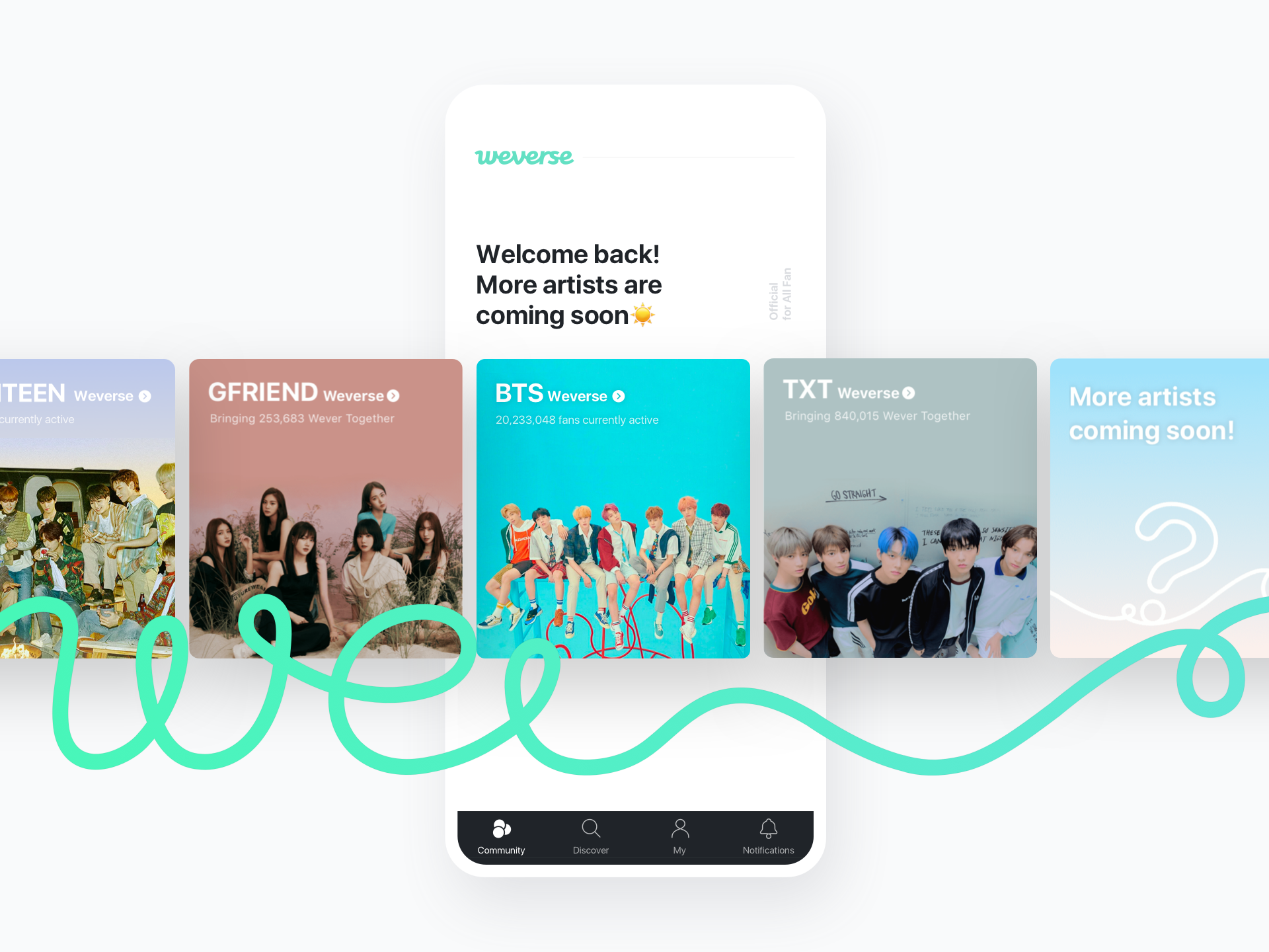
Weverse, Global Kpop Community Platform

Weverse Shop, Global Kpop E-commerce Platform